2020 Election Maps
ggplot2
tutorial
maps
Creating 2020 election maps using ggplot2
The What
This tutorial walks through how to create various election maps using ggplot2 and open-source election data from MIT and the North Carolina State Board of Elections. Admittedly, much of the plotting process will be the same. Once you understand how to make this kind of map, it’s fairly easy to extend the workflow to other data.
There are lots of cool maps to create in R, and over the coming weeks, I intended to post a few more articles outlining different options.
What we will be creating
NC Gov. Race
Presidential, County Race
Presidential, NC Race
The How
For this table, we will need:
For starters, we’re going to define a base theme that every plot will use.
theme_politics <- function() {
  ggthemes::theme_map() +
    theme(
      plot.title.position = "plot",
      plot.title = element_text(family = "RadioCanadaBig-Bold", hjust = 0.5, size = 24, vjust = 0),
      plot.subtitle = element_text(
        family = "RadioCanadaBig-Regular", hjust = 0.5,
        vjust = -1, size = 16
      ),
      plot.caption.position = "plot",
      plot.caption = element_text(family = "RadioCanadaBig-Regular", size = 12, hjust = 0.5),
      legend.position = "none",
      plot.margin = margin(
        t = 20,
        r = 20,
        b = 20,
        l = 20, unit = "pt"
      ),
      plot.background = element_rect(fill = "#F6F7F2")
    )
}
Gov. Race
Plotting the 2020 North Carolina Governor race.
The Data
To speed things up, I took the full data set from NCSBE, converted it to .parquet, and uploaded it to HuggingFace for retrieval. By default, NCSBE returns data in .txt (hello, it’s 2024 ???) which can take a while to download and index. This will be much quicker.
gov_data <- cbbdata:::parquet_from_url("https://huggingface.co/datasets/andreweatherman/election-maps/resolve/main/results_pct_20201103.parquet?download=true")| County | Election Date | Precinct | Contest Group ID | Contest Type | Contest Name | Choice | Choice Party | Vote For | Election Day | One Stop | Absentee by Mail | Provisional | Total Votes | Real Precinct | …16 |
|---|---|---|---|---|---|---|---|---|---|---|---|---|---|---|---|
| TYRRELL | 11/03/2020 | 3 | 1359 | S | NC TREASURER | Ronnie Chatterji | DEM | 1 | 16 | 0 | 0 | 0 | 16 | Y | NA |
| WAYNE | 11/03/2020 | 06 | 1011 | S | NC COURT OF APPEALS JUDGE SEAT 05 | Fred Gore | REP | 1 | 95 | 0 | 0 | 0 | 95 | Y | NA |
| FORSYTH | 11/03/2020 | 081 | 1342 | S | NC SUPERINTENDENT OF PUBLIC INSTRUCTION | Jen Mangrum | DEM | 1 | 204 | 1076 | 367 | 7 | 1654 | Y | NA |
| NEW HANOVER | 11/03/2020 | W03 | 1373 | S | US PRESIDENT | Donald J. Trump | REP | 1 | 71 | 0 | 31 | 1 | 103 | Y | NA |
| MECKLENBURG | 11/03/2020 | 241 | 1008 | S | NC COMMISSIONER OF INSURANCE | Mike Causey | REP | 1 | 348 | 2257 | 0 | 0 | 2605 | Y | NA |
| TRANSYLVANIA | 11/03/2020 | PF | 1009 | S | NC COMMISSIONER OF LABOR | Jessica Holmes | DEM | 1 | 28 | 225 | 102 | 0 | 355 | Y | NA |
Cleaning
To “clean” our data, we want to do a few things.
- Standardize column names with
janitor::clean_namesfor easier typing. - Filter down to just the Governor race.
- Sum across all votes in each county to retrieve the total number of county votes.
- Count the total votes for each candidate, in each county, and compute the percentage won.
- Filter down to Roy Cooper.
For plotting purposes, our county names need to be lowercase. We also will be plotting relative to a single candidate’s proportion, which will make more sense later, so we only need to chose between one major candidate. Your choice is largely irrelevant and will only affect the direction of your color scale when plotting. Because voters can cast ballots for third-party candidates, we wait to filter until the last step.
gov_data <- gov_data %>%
  janitor::clean_names() %>%
  filter(contest_name == "NC GOVERNOR") %>%
    mutate(total_county_votes = sum(total_votes),
         county = tolower(county),
         .by = county) %>%
  summarize(total = sum(total_votes),
            prop = total / first(total_county_votes),
            .by = c(choice, county)) %>%
filter(choice == "Roy Cooper") | choice | county | total | prop |
|---|---|---|---|
| Roy Cooper | durham | 147110 | 0.8191208 |
| Roy Cooper | orange | 65042 | 0.7668691 |
| Roy Cooper | hertford | 7212 | 0.6824375 |
| Roy Cooper | mecklenburg | 382726 | 0.6780716 |
| Roy Cooper | edgecombe | 16786 | 0.6595937 |
| Roy Cooper | warren | 6716 | 0.6523555 |
The plot
To plot U.S. maps in ggplot2, I recommend taking advantage of map_data and geom_polygon. map_data returns data from the maps package as a data frame suitable for plotting. You’ll need to join this output with your data. For this example, we only care about North Carolina, so we filter our region to “north carolina.” Importantly, we need to use join_by because our joining “keys” are mismatched (“county” vs. “subregion”).
County Lines
Secondly, to draw county lines we can use geom_path and, again, pull county data from map_data. We can also set border colors (color) and border thickness (linewidth).
Colors
As mentioned above, the candidate you filter on doesn’t matter…but you might need to adjust your color scale depending on their political party. In our example, we chose Roy Cooper, a Democrat, and we are using the “Red-Blue Diverging” palette from ggthemes. If your chosen candidate is Republican, you will need to add direction = -1 inside of scale_fill_paletteer_c to “flip” the scale and have red, instead, as the high point.
Aside from those points, this plot is pretty straightforward. Make sure you have the Radio Canada Big font installed on your machine. You can grab it for free from Google Fonts.
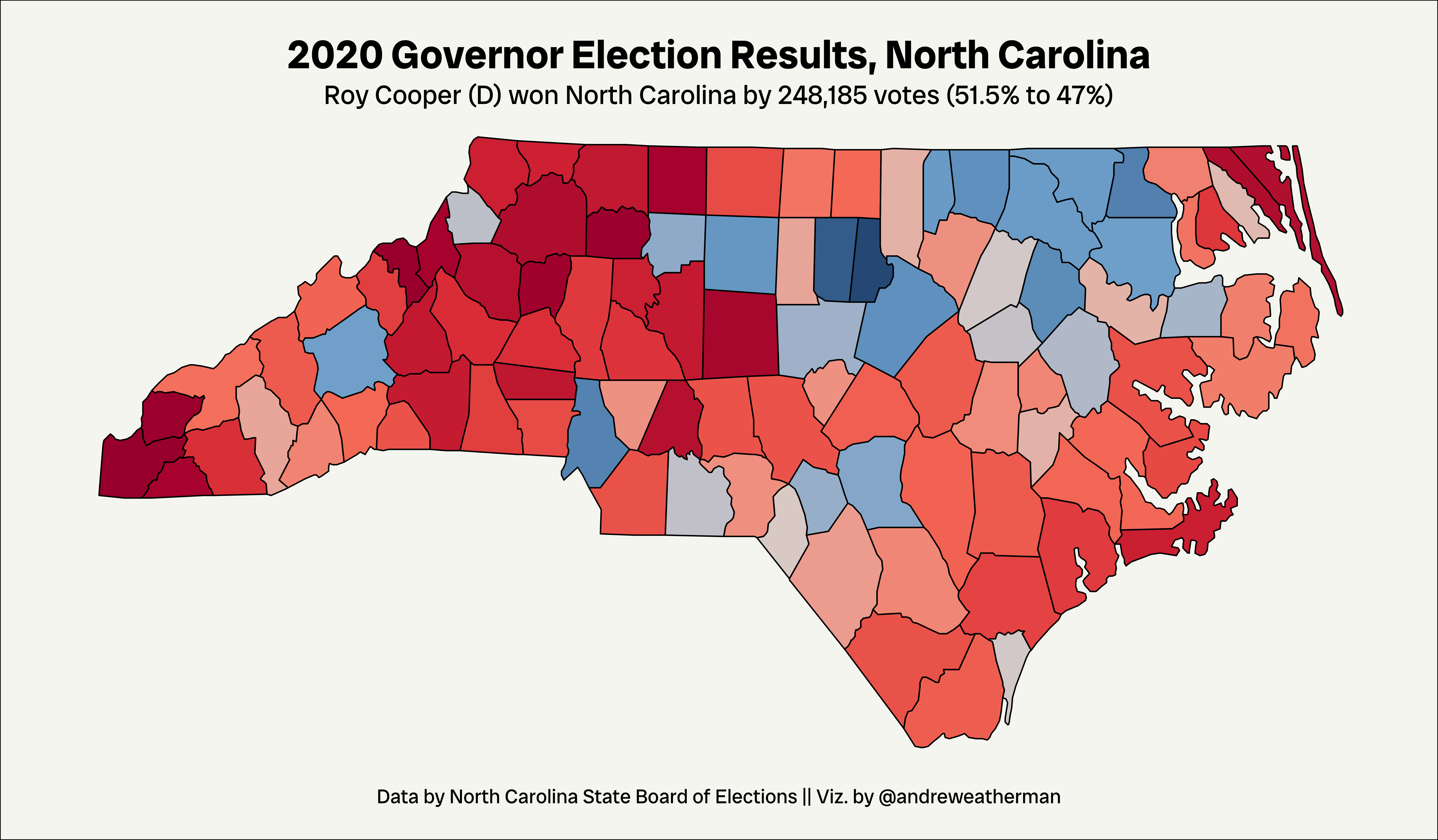
gov_data_plot <- gov_data %>%
  left_join(map_data("county", region = 'north carolina'), join_by("county" == "subregion")) %>%
  ggplot(aes(long, lat, fill = prop, group = group)) +
  geom_polygon() +
  geom_path(data = map_data("county", region = 'north carolina'), aes(long, lat, group = group),
            color = "black", linewidth = 0.4, inherit.aes = FALSE) +
  paletteer::scale_fill_paletteer_c("ggthemes::Red-Blue Diverging") +
  theme_politics() +
  labs(title = "2020 Governor Election Results, North Carolina",
       subtitle = "Roy Cooper (D) won North Carolina by 248,185 votes (51.5% to 47%)",
       caption = "Data by North Carolina State Board of Elections || Viz. by @andreweatherman")
Saving
National Race, County
Plotting the 2020 Presidential Election on a per-county, national level.
The Data
Like the Governor data, I pulled this from MIT and also uploaded it to HuggingFace. One note: I think this data is missing Oglala Lakota county in South Dakota. If you’re producing these maps in 2024, please ensure that your data is both accurate and complete.
| year | state | state_po | county_name | county_fips | office | candidate | party | candidatevotes | totalvotes | version | mode |
|---|---|---|---|---|---|---|---|---|---|---|---|
| 2020 | ALABAMA | AL | AUTAUGA | 1001 | US PRESIDENT | JOSEPH R BIDEN JR | DEMOCRAT | 7503 | 27770 | 20220315 | TOTAL |
| 2020 | ALABAMA | AL | AUTAUGA | 1001 | US PRESIDENT | OTHER | OTHER | 429 | 27770 | 20220315 | TOTAL |
| 2020 | ALABAMA | AL | AUTAUGA | 1001 | US PRESIDENT | DONALD J TRUMP | REPUBLICAN | 19838 | 27770 | 20220315 | TOTAL |
| 2020 | ALABAMA | AL | BALDWIN | 1003 | US PRESIDENT | JOSEPH R BIDEN JR | DEMOCRAT | 24578 | 109679 | 20220315 | TOTAL |
| 2020 | ALABAMA | AL | BALDWIN | 1003 | US PRESIDENT | OTHER | OTHER | 1557 | 109679 | 20220315 | TOTAL |
| 2020 | ALABAMA | AL | BALDWIN | 1003 | US PRESIDENT | DONALD J TRUMP | REPUBLICAN | 83544 | 109679 | 20220315 | TOTAL |
Cleaning
To “clean” our data, we want to do a few things.
- Calculate the proportion of total votes won in a county – summing
candidatevotesand dividing bytotalvotes– for each candidate in each county. - Like above, filter to a single candidate.
- Bring on county geographic information by joining on fips codes.
county_data <- county_data %>%
  reframe(prop = sum(candidatevotes) / totalvotes,
          .by = c(candidate, county_fips)) %>%
  filter(candidate == "JOSEPH R BIDEN JR") %>%
left_join(read_rds("https://huggingface.co/datasets/andreweatherman/election-maps/resolve/main/county_map_fips.rds?download=true"), join_by("county_fips" == "fips"))| candidate | county_fips | prop | long | lat | group | order | region | subregion |
|---|---|---|---|---|---|---|---|---|
| JOSEPH R BIDEN JR | 1001 | 0.2701837 | -86.50517 | 32.34920 | 1 | 1 | alabama | autauga |
| JOSEPH R BIDEN JR | 1001 | 0.2701837 | -86.53382 | 32.35493 | 1 | 2 | alabama | autauga |
| JOSEPH R BIDEN JR | 1001 | 0.2701837 | -86.54527 | 32.36639 | 1 | 3 | alabama | autauga |
| JOSEPH R BIDEN JR | 1001 | 0.2701837 | -86.55673 | 32.37785 | 1 | 4 | alabama | autauga |
| JOSEPH R BIDEN JR | 1001 | 0.2701837 | -86.57966 | 32.38357 | 1 | 5 | alabama | autauga |
| JOSEPH R BIDEN JR | 1001 | 0.2701837 | -86.59111 | 32.37785 | 1 | 6 | alabama | autauga |
The plot
Like mentioned at the start of this post, most of the plotting workflow is the same, so I’ll spare repeating the same information as above.
State Lines
To draw state borders, we’re going to use the same process as before but switch to pulling map_data("state") while also thickening the borders.
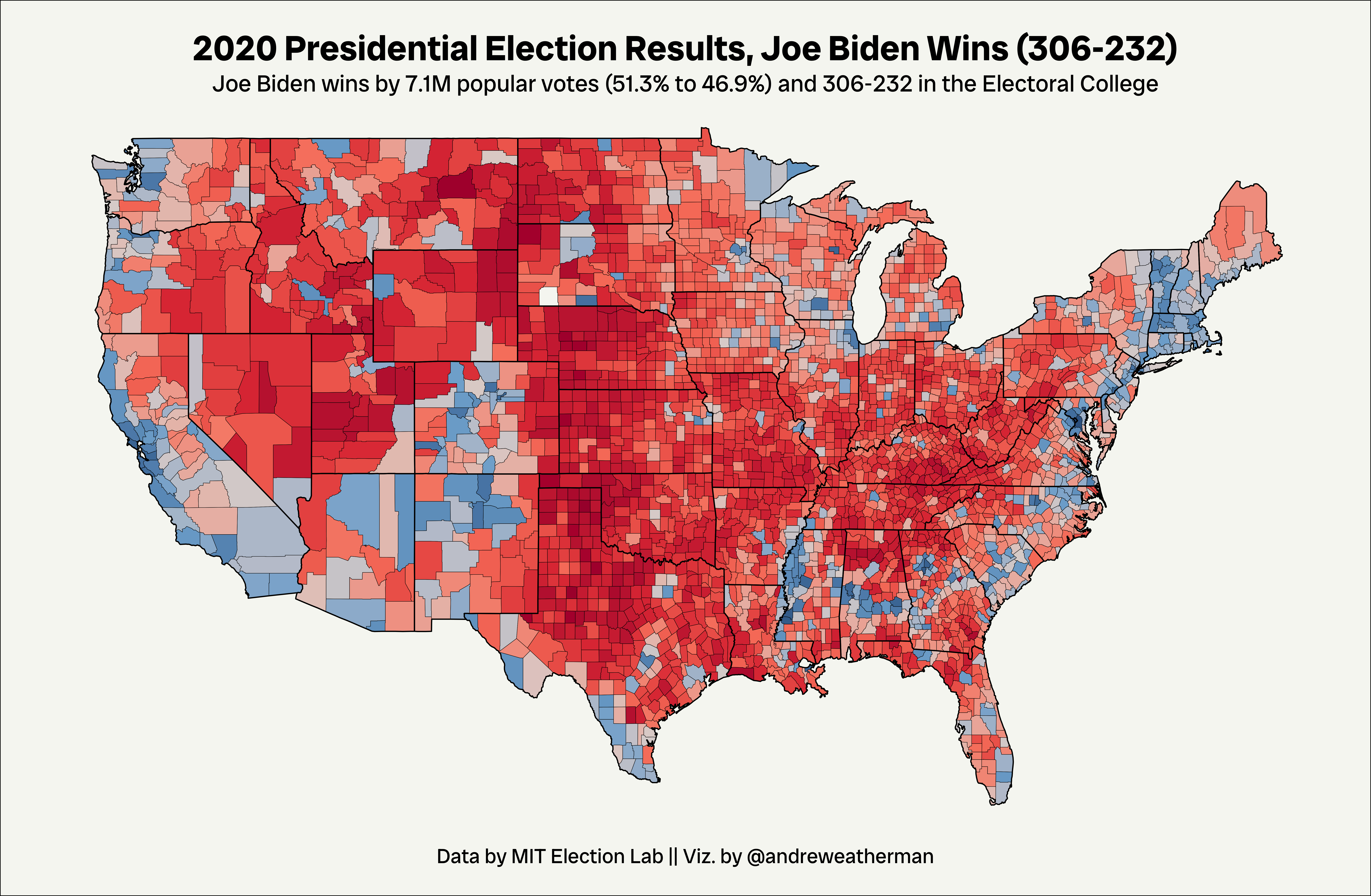
county_plot <- county_data %>%
  ggplot(aes(long, lat, fill = prop, group = group)) +
  geom_polygon() +
  geom_path(data = map_data("state"), aes(long, lat, group = group),
            color = "black", linewidth = 0.4, inherit.aes = FALSE) +
  geom_path(data = map_data("county"), aes(long, lat, group = group),
            color = "black", linewidth = 0.1, inherit.aes = FALSE) +
  paletteer::scale_fill_paletteer_c("ggthemes::Red-Blue Diverging") +
  ggthemes::theme_map() +
  theme(plot.title.position = "plot",
        plot.title = element_text(family = "RadioCanadaBig-Bold", hjust = 0.5, size = 24, vjust = 0),
        plot.subtitle = element_text(family = "RadioCanadaBig-Regular", hjust = 0.5,
                                     vjust = -1, size = 16),
        plot.caption.position = "plot",
        plot.caption = element_text(family = "RadioCanadaBig-Regular", size = 14, hjust = 0.5),
        legend.position = "none",
        plot.margin = margin(
          t = 20,
          r = 20,
          b = 20,
          l = 20, unit = "pt"),
        plot.background = element_rect(fill = "#F6F7F2")) +
  labs(title = "2020 Presidential Election Results, Joe Biden Wins (306-232)",
       subtitle = "Joe Biden wins by 7.1M popular votes (51.3% to 46.9%) and 306-232 in the Electoral College",
       caption = "Data by MIT Election Lab || Viz. by @andreweatherman")
Saving
National Race, State
Plotting the 2020 Presidential Election on a per-county level in North Carolina.
The Data
| year | state | state_po | county_name | county_fips | office | candidate | party | candidatevotes | totalvotes | version | mode |
|---|---|---|---|---|---|---|---|---|---|---|---|
| 2020 | NORTH CAROLINA | NC | ALAMANCE | 37001 | US PRESIDENT | JOSEPH R BIDEN JR | DEMOCRAT | 10159 | 86091 | 20220315 | ABSENTEE BY MAIL |
| 2020 | NORTH CAROLINA | NC | ALAMANCE | 37001 | US PRESIDENT | JOSEPH R BIDEN JR | DEMOCRAT | 5264 | 86091 | 20220315 | ELECTION DAY |
| 2020 | NORTH CAROLINA | NC | ALAMANCE | 37001 | US PRESIDENT | JOSEPH R BIDEN JR | DEMOCRAT | 23256 | 86091 | 20220315 | ONE STOP |
| 2020 | NORTH CAROLINA | NC | ALAMANCE | 37001 | US PRESIDENT | JOSEPH R BIDEN JR | DEMOCRAT | 146 | 86091 | 20220315 | PROVISIONAL |
| 2020 | NORTH CAROLINA | NC | ALAMANCE | 37001 | US PRESIDENT | OTHER | GREEN | 50 | 86091 | 20220315 | ABSENTEE BY MAIL |
| 2020 | NORTH CAROLINA | NC | ALAMANCE | 37001 | US PRESIDENT | OTHER | GREEN | 55 | 86091 | 20220315 | ELECTION DAY |
Cleaning
Largely the same process as the previous plot.
state_data <- state_data %>%
  reframe(total_votes = sum(candidatevotes),
          prop = total_votes / totalvotes,
          .by = c(candidate, county_fips)) %>%
  filter(candidate == "JOSEPH R BIDEN JR") %>%
left_join(read_rds("https://huggingface.co/datasets/andreweatherman/election-maps/resolve/main/county_map_fips.rds?download=true"), join_by("county_fips" == "fips"))| candidate | county_fips | total_votes | prop | long | lat | group | order | region | subregion |
|---|---|---|---|---|---|---|---|---|---|
| JOSEPH R BIDEN JR | 37001 | 38825 | 0.4509763 | -79.53800 | 35.84424 | 1857 | 54915 | north carolina | alamance |
| JOSEPH R BIDEN JR | 37001 | 38825 | 0.4509763 | -79.54372 | 35.89008 | 1857 | 54916 | north carolina | alamance |
| JOSEPH R BIDEN JR | 37001 | 38825 | 0.4509763 | -79.53800 | 35.98175 | 1857 | 54917 | north carolina | alamance |
| JOSEPH R BIDEN JR | 37001 | 38825 | 0.4509763 | -79.52081 | 36.23385 | 1857 | 54918 | north carolina | alamance |
| JOSEPH R BIDEN JR | 37001 | 38825 | 0.4509763 | -79.26298 | 36.23385 | 1857 | 54919 | north carolina | alamance |
| JOSEPH R BIDEN JR | 37001 | 38825 | 0.4509763 | -79.27444 | 35.90726 | 1857 | 54920 | north carolina | alamance |
The plot
Just as the previous plot.
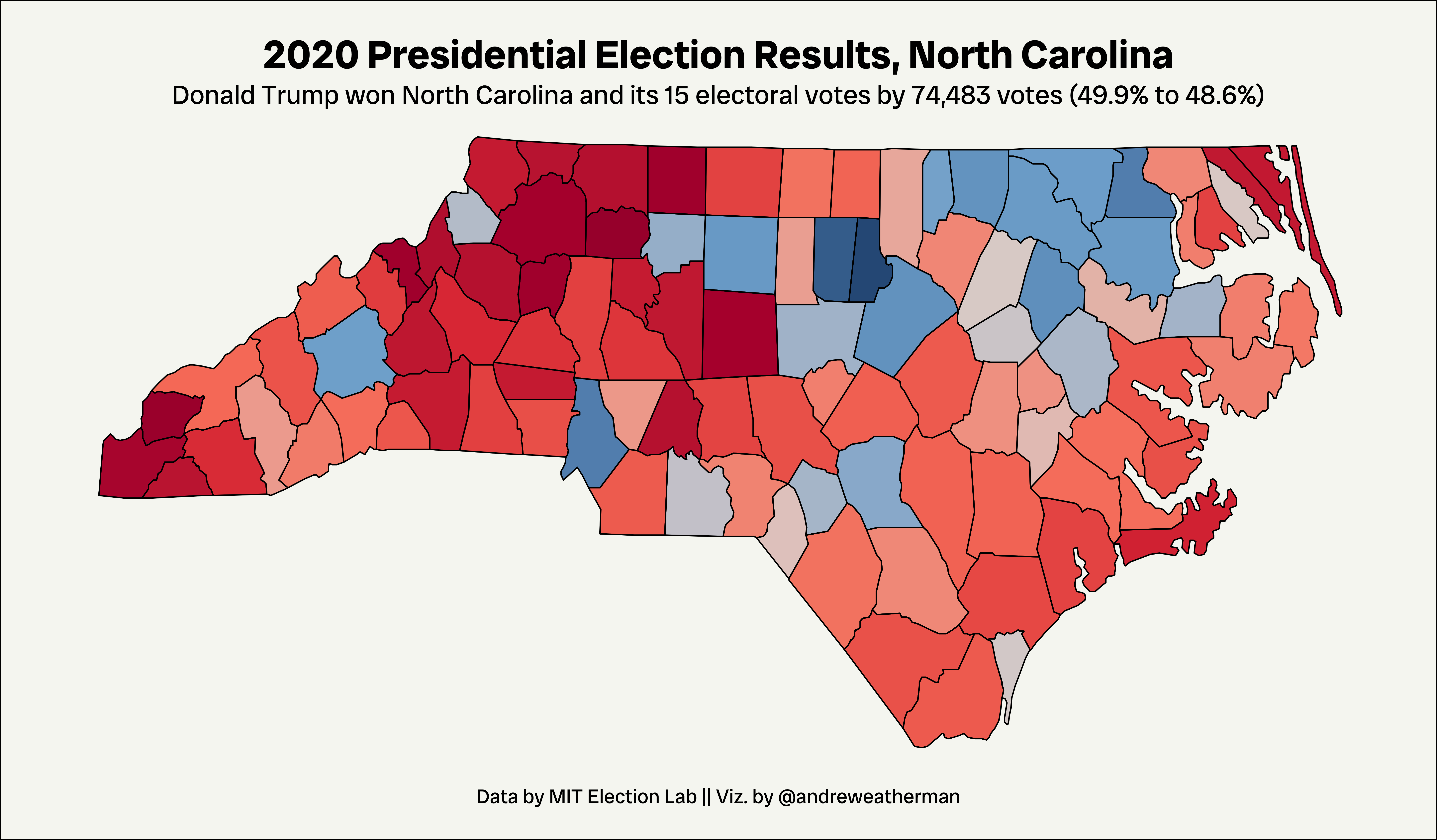
nc_pres <- state_data %>%
  ggplot(aes(long, lat, fill = prop, group = group)) +
  geom_polygon() +
  geom_path(data = map_data("county", region = 'north carolina'), aes(long, lat, group = group),
            color = "black", linewidth = 0.4, inherit.aes = FALSE) +
  paletteer::scale_fill_paletteer_c("ggthemes::Red-Blue Diverging") +
  theme_politics() +
  labs(title = "2020 Presidential Election Results, North Carolina",
       subtitle = "Donald Trump won North Carolina and its 15 electoral votes by 74,483 votes (49.9% to 48.6%)",
       caption = "Data by MIT Election Lab || Viz. by @andreweatherman")
Saving