Jittered Logo Plot
ggplot2
tutorial
Creating a beeswarm-like plot with team logos
The What
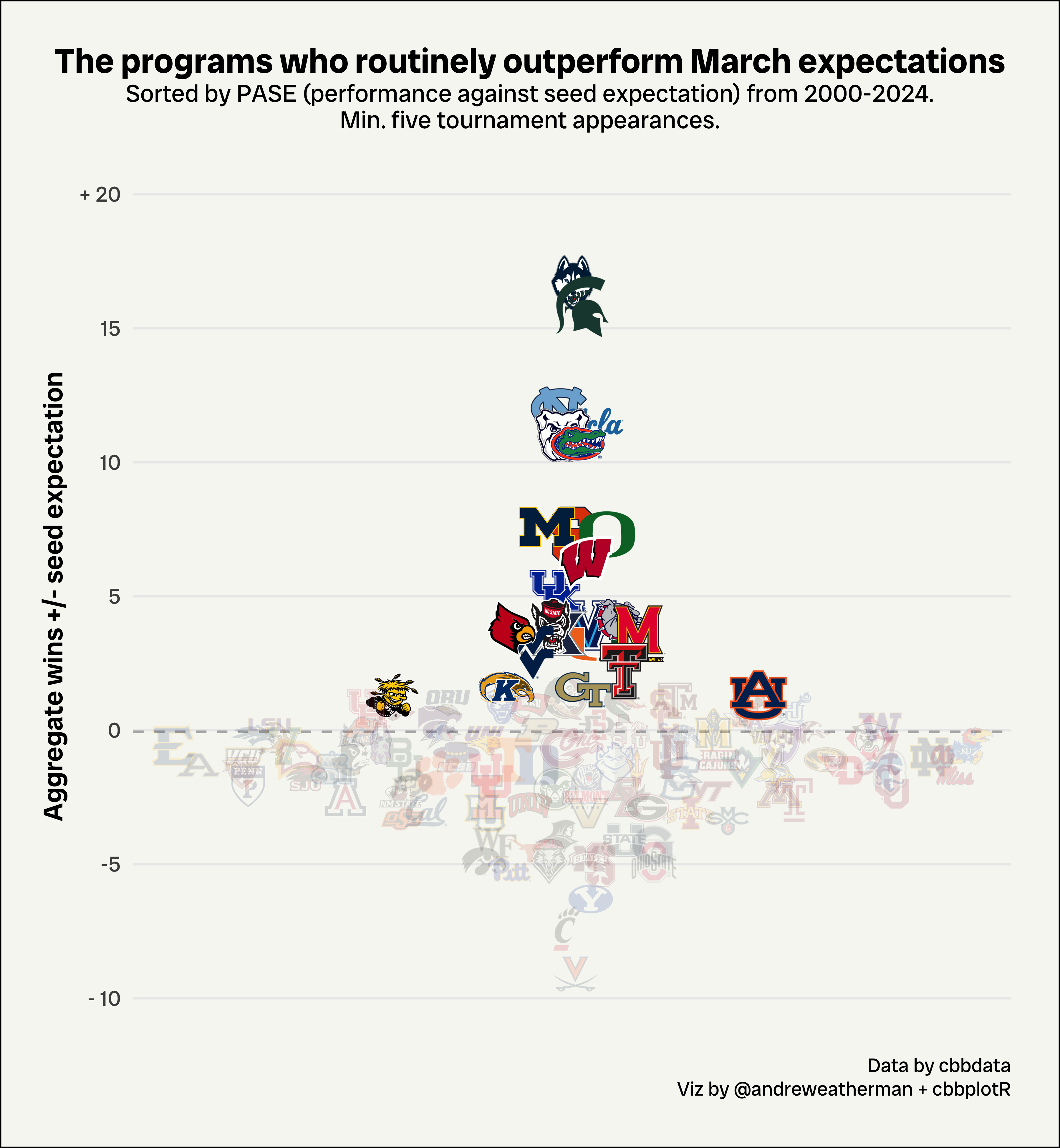
This tutorial walks through how to create jittered logo plots using ggplot2 and cbbplotR for college basketball. We will be plotting performance against seed expectation – the cumulative number of wins above or below seed expectation – from 2000-2024 for every team with at least five tournament appearances.
What we will be creating
The How
For this table, we will need:
The Data
For this visualization, we will be pulling data from Barttorvik using the cbbdata package.
data <- cbd_torvik_ncaa_results(2000, 2024) %>%
  filter(r64 >= 5) %>%
  select(team, pase) %>%
  mutate(pase_rk = dense_rank(-pase))
All we’re doing here is pulling tournament performance data, filtering for five or more appearances (r64), and calculating PASE rank – which will be used to highlight top teams.
| team | pase | pase_rk |
|---|---|---|
| Connecticut | 16.7 | 1 |
| North Carolina | 12.0 | 3 |
| Michigan St. | 15.8 | 2 |
| UCLA | 11.5 | 4 |
| Butler | 11.0 | 5 |
| Syracuse | 7.3 | 8 |
Plotting
Calculate the jitter
We want to “jitter” our plot, which is something made easy by using the ggbeeswarm package. “Jittering” broadly refers to offsetting points to minimize overlap. Unfourtantely, cbbplotR does not yet support jittering points, so we need to do it ourselves.
Behind the scenes, ggbeeswarm uses the vipor package and its offsetSingleGroup function to calculate new x-values for plotting. With this knowledege, we can create a small wrapper around offsetSingleGroup to achieve similar results.
calculate_quasirandom_jitter <- function(y, x, width = 0.2) {
  jittered_offset <- offsetSingleGroup(y, method = "quasirandom")
  jittered_offset <- jittered_offset * width
  x + jittered_offset
}
Next, we’ll apply this function to our data.
head(data)| team | pase | pase_rk | x |
|---|---|---|---|
| Connecticut | 16.7 | 1 | 0.9989608 |
| North Carolina | 12.0 | 3 | 0.9921481 |
| Michigan St. | 15.8 | 2 | 1.0026556 |
| UCLA | 11.5 | 4 | 1.0095699 |
| Butler | 11.0 | 5 | 0.9939375 |
| Syracuse | 7.3 | 8 | 0.9987336 |
Plotting
Now, time to plot! Let’s briefly go over some things:
geom_mean_lines
This is a utility function to add mean (or median) lines to any plot. Notice that you must refer to your values as either y0 or x0, not y or x.
scale_X_identity
Inside geom_cbb_teams, you might notice that we are conditionally defining widths (logo size) and alpha (logo transparency) values. The scale_x_identity family of functions are used when “your data is already scaled such that the data and aesthetic spaces are the same.” That is, whenever you are passing direct values for a scale inside of any aes, you must use the appropriate _identity function for ggplot to recognize those values as literal representations.
plot.margin
This is how you add padding to your plot. Sometimes padding makes your graph look a bit cleaner.
Using ggpreview with logo plots
If you are plotting numerous team logos, you might notice that RStudio can be slow to return the plot itself – which can possibly lead to your R session aborting. To fix this, cbbplotR borrows a function from the ggpath package called ggpreview – which saves a temporary image of your plot and returns it in the Viewer pane. It is recommend to then expand that window in your browser.
To use ggpreview, you need to store your plot as a variable and then pass it to the ggpreview function. The function also takes arguments for plot dimensions.
For example, if we were to draw a plot showing every team’s adjusted efficiencies, that would require rendering 362 logos, which would definitely cause us some problems. But with ggpreview, we can store our plot as a variable and view a temporary image of it! This entire process takes fewer than 10 seconds.
The plot
plot <- data %>%
  ggplot(aes(x, pase)) +
  geom_mean_lines(aes(y0 = pase), color = "grey70") +
  geom_cbb_teams(aes(team = team,
                     width = ifelse(pase_rk <= 20, 0.07, 0.055),
                     alpha = ifelse(pase_rk <= 20, 1, 0.15))) +
  scale_alpha_identity() +
  scale_y_continuous(breaks = seq(-10, 20, 5), labels = c("- 10", as.character(seq(-5, 15, 5)), "+ 20"),
                     limits = c(-10, 20)) +
  theme_minimal() +
  theme(plot.title.position = "plot",
        plot.title = element_text(family = "RadioCanadaBig-Bold", hjust = 0.5, size = 14),
        plot.subtitle = element_text(family = "RadioCanadaBig-Regular", hjust = 0.5,
                                     vjust = 2.7, size = 10),
        plot.caption.position = "plot",
        plot.caption = ggtext::element_markdown(family = "RadioCanadaBig-Regular",
                                                lineheight = 1.2, size = 8),
        axis.text = element_text(family = "RadioCanadaBig-Regular"),
        axis.title = element_text(family = "RadioCanadaBig-SemiBold"),
        axis.title.y = element_text(vjust = 2),
        axis.text.x = element_blank(),
        plot.margin = margin(t = 20, r = 20, b = 20, l = 20, unit = "pt"),
        panel.grid.major.x = element_blank(),
        panel.grid.minor.x = element_blank(),
        panel.grid.minor.y = element_blank(),
        plot.background = element_rect(fill = "#F6F7F2")) +
  labs(title = "The programs who routinely outperform March expectations",
       subtitle = "Sorted by PASE (performance against seed expectation) from 2000-2024.\nMin. five tournament appearances.",
       caption = "Data by cbbdata<br>Viz by @andreweatherman + cbbplotR",
       y = "Aggregate wins +/- seed expectation",
       x = NULL)
Saving the plot
When you’re using custom fonts, as we are, sometimes ggsave won’t properly render them. To sidestep this, you need to specify a device, shown below.