NBA Points by Blue Bloods
ggplot
college basketball
scraping
Stacked bar charts with
ggplot
Plot
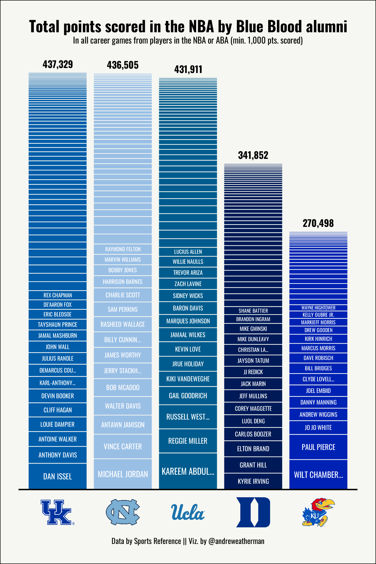
In early February 2024, Todd Whitehead tweeted a visualization that illustrated points scored in the NBA by former Duke and North Carolina players.
This code, not yet accompanied by a tutorial, works to recreate that visualization using ggplot2 and data from Sports Reference for Duke, North Carolina, Kentucky, Kansas, and UCLA players (the primary “Blue Bloods” of college basketball).
What we will be creating
Full source code
library(rvest)
library(tidyverse)
library(cbbplotR)
library(cbbdata)
library(showtext)

## add oswald font from google fonts
font_add_google("Oswald", "oswald")
showtext_auto()

## create a function for scraping career points scored by players from certain
## colleges
get_players <- function(team, slug) {

  ## grab color of team for bar fill
  color <- filter(cbd_teams(), common_team == team)$color

  read_html(paste0("https://www.basketball-reference.com/friv/colleges.fcgi?college=", slug)) %>%
    html_nodes("#nba_aba_players") %>%
    html_table() %>%
    pluck(1) %>%
    janitor::row_to_names(1) %>%
    janitor::clean_names() %>%
    select(player, pts) %>%
    mutate(pts = as.numeric(pts)) %>%
    filter(!is.na(pts)) %>%
    arrange(desc(pts)) %>%
    mutate(
      player = trimws(gsub("\\*", "", player)), ## remove * from some names
      player = factor(player, levels = player), ## set an ordering factor for the bars
      team = team,
      fill = color,
      ## only include names of first 15 players, truncate them to 15 chars.
      label = ifelse(row_number() <= 15, str_trunc(as.character(player), 15), "")
    )
}

## loop over schools
plotting_data <- map2_dfr(
  .x = c("Duke", "North Carolina", "Kansas", "Kentucky", "UCLA"),
  .y = c("duke", "unc", "kansas", "kentucky", "ucla"),
  \(team, slug) get_players(team, slug)
)

p <- plotting_data %>%
  ## min. 1000 points scored
  filter(pts >= 1000) %>%
  ## order teams by total points scored
  ggplot(aes(x = fct_reorder(team, -pts, sum), y = pts, fill = fill)) +
  ## stack bars and decrease line width
  geom_bar(position = "stack", stat = "identity", color = "#F6F7F2", linewidth = 0.25) +
  ## label for players
  geom_text(aes(label = toupper(label), size = pts),
    position = position_stack(vjust = 0.5),
    color = "white", family = "oswald"
  ) +
  ## calc. total points scored and include label (nudge label up)
  geom_text(
    data = ~ summarize(.x, total = sum(pts), .by = team),
    aes(label = scales::label_comma()(total), x = team, y = total),
    size = 8, fontface = "bold", inherit.aes = FALSE,
    family = "oswald", nudge_y = 9000
  ) +
  ## line above logos
  geom_hline(yintercept = 0, linewidth = 0.5) +
  scale_size(range = c(2, 7)) +
  scale_fill_identity() +
  ## decrease space b/w logos and plot // set limit to above the highest
  ## total points scored
  scale_y_continuous(expand = c(0.01, 0), limits = c(0, 450000)) +
  theme_void() +
  theme(
    axis.text.x = element_cbb_teams(size = 1),
    legend.position = "none",
    plot.title.position = "plot",
    plot.caption.position = "plot",
    plot.title = element_text(
      hjust = 0.5, vjust = 3, face = "bold", size = 36,
      family = "oswald"
    ),
    plot.subtitle = element_text(
      hjust = 0.5, vjust = 8, size = 20,
      family = "oswald"
    ),
    plot.caption = element_text(
      hjust = 0.5, family = "oswald",
      size = 18
    ),
    ## set margins
    plot.margin = unit(c(0.5, 0.5, 0.5, 0.5), "cm"),
    ## make background off-white
    plot.background = element_rect(fill = "#F6F7F2")
  ) +
  labs(
    title = "Total points scored in the NBA by Blue Blood alumni",
    subtitle = "In all career games from players in the NBA or ABA (min. 1,000 pts. scored)",
    caption = "Data by Sports Reference || Viz. by @andreweatherman"
  )

## save
ggsave(plot = p, "viz/most-nba-points/plot.png", w = 4, h = 6)